Data Visualization--Lineplot & Violinplot
2020-03-10
Examples : The weight of chicks from different months and feed diet.
Firstly, have a look at dataset. The structure of dataset is following:
setwd("C:/blog/Dataset")
# library
library(tidyverse)
library(ggplot2)
library(hrbrthemes)
Chick_data <- ChickWeight

str(Chick_data)
## Classes 'nfnGroupedData', 'nfGroupedData', 'groupedData' and 'data.frame': 578 obs. of 4 variables:
## $ weight: num 42 51 59 64 76 93 106 125 149 171 ...
## $ Time : num 0 2 4 6 8 10 12 14 16 18 ...
## $ Chick : Ord.factor w/ 50 levels "18"<"16"<"15"<..: 15 15 15 15 15 15 15 15 15 15 ...
## $ Diet : Factor w/ 4 levels "1","2","3","4": 1 1 1 1 1 1 1 1 1 1 ...
## - attr(*, "formula")=Class 'formula' language weight ~ Time | Chick
## .. ..- attr(*, ".Environment")=<environment: R_EmptyEnv>
## - attr(*, "outer")=Class 'formula' language ~Diet
## .. ..- attr(*, ".Environment")=<environment: R_EmptyEnv>
## - attr(*, "labels")=List of 2
## ..$ x: chr "Time"
## ..$ y: chr "Body weight"
## - attr(*, "units")=List of 2
## ..$ x: chr "(days)"
## ..$ y: chr "(gm)"Then, have a look at the first 5 lines in datasets, we could find the dataset includes weight, chick numbers, diet and times variables.
head(Chick_data, n =5)## weight Time Chick Diet
## 1 42 0 1 1
## 2 51 2 1 1
## 3 59 4 1 1
## 4 64 6 1 1
## 5 76 8 1 1Line plot
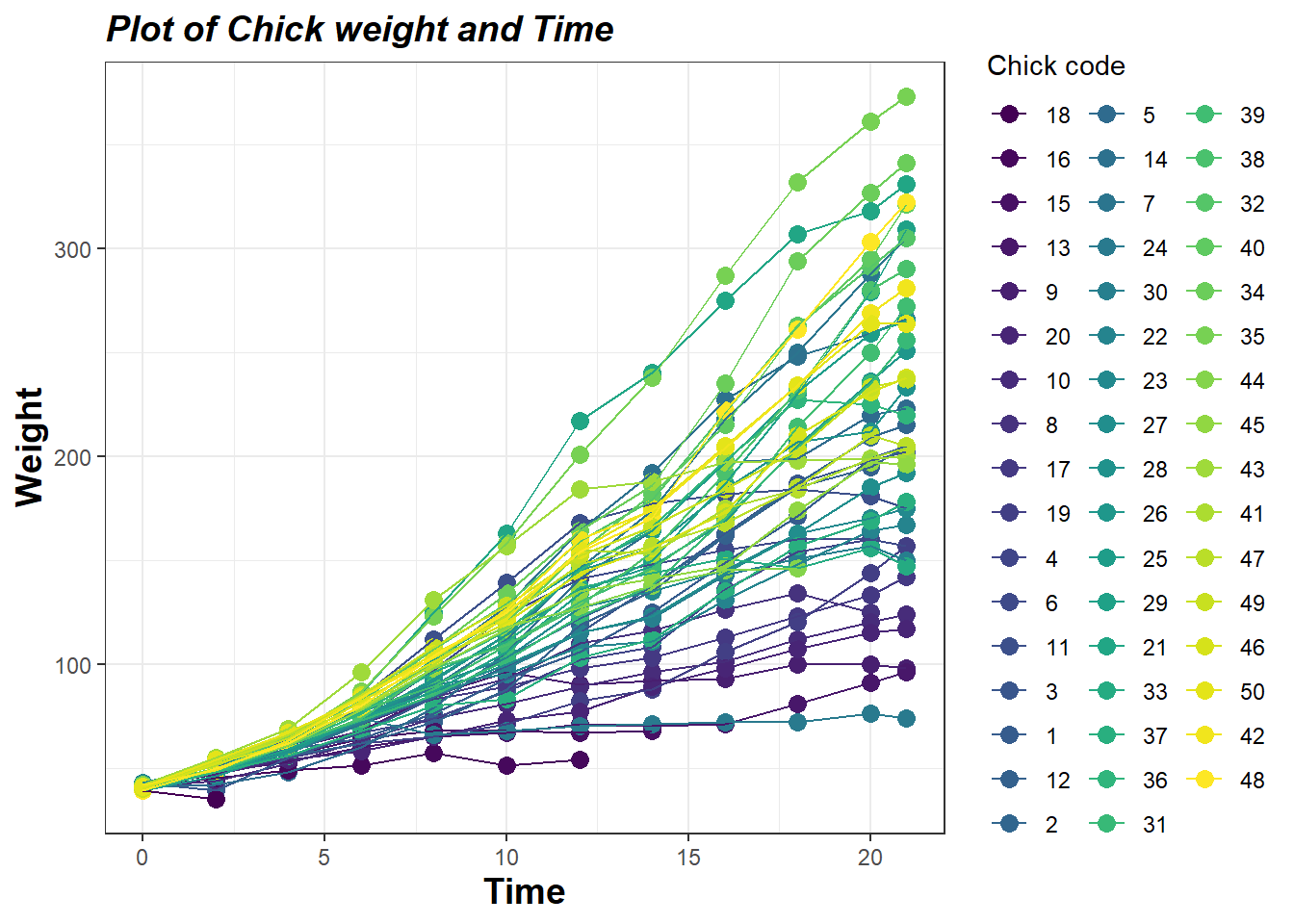
To explore the relationship between weight and time using package ggplot2
g1 <- ggplot(data = Chick_data,aes(x = Time, y = weight, color = Chick)) +
  geom_point(size = 3L)+
  geom_line()+
  labs(title="Plot of Chick weight and Time",
       x = "Time", y = "Weight",color = "Chick code") +
  theme_bw()+
  theme(
    plot.title = element_text(color="black", size=14, face="bold.italic"),
    axis.title.x = element_text(color="black", size=14, face="bold"),
    axis.title.y = element_text(color="black", size=14, face="bold")
  )
g1
The results from plot indicated that the weight incresed with the increasing times.
Violin plot
To explore the relationship between weight and time using violin plot
g2 <- ggplot(data = Chick_data,aes(x = Diet, y = weight, fill = Diet)) +
  geom_violin(aes(fill = factor(Diet)))+
  geom_boxplot(width=0.1)+
  labs(title="Plot of Chick weight and Feed diet",
       x = "Diet", y = "Weight",color = "Feed Diet") +
  theme_bw()+
  theme(
    plot.title = element_text(color="black", size=14, face="bold.italic"),
    axis.title.x = element_text(color="black", size=14, face="bold"),
    axis.title.y = element_text(color="black", size=14, face="bold")
  )
g2